Color Theory
color theory in html and css

What is Color Theory?
Color theory is the study of how colors work together and how they affect our emotions and perceptions. It's like a toolbox for artists, designers, and creators to help them choose the right colors for their projects. Color theory enables you to pick colors that go well together and convey the right mood or message in your work.
Use a Color Scheme and Color Temperature for Design Harmony
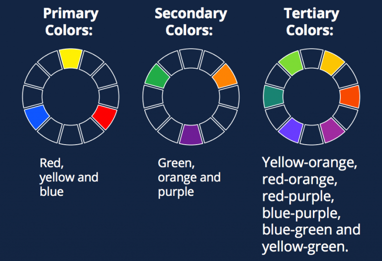
In screen design, designers use the additive color model, where red, green and blue are the primary colors. Just as you need to place images and other elements in visual design strategically, your color choices should optimize your users’ experience in attractive interfaces with high usability. When starting your design process, you can consider using any of these main color scheme
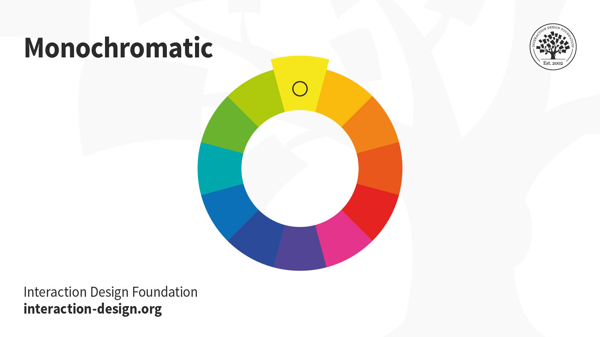
Monochromatic: Take one hue and create other elements from different shades and tints of it.
© Interaction Design Foundation, CC BY-SA 4.0
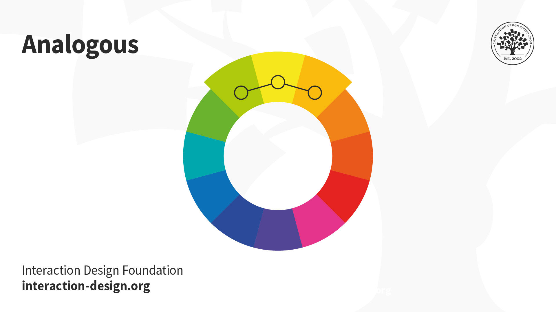
Analogous: Use three colors located beside one another on the color wheel (e.g., orange, yellow-orange and yellow to show sunlight). A variant is to mix white with these to form a “high-key” analogous color scheme (e.g., flames).
© Interaction Design Foundation, CC BY-SA 4.0
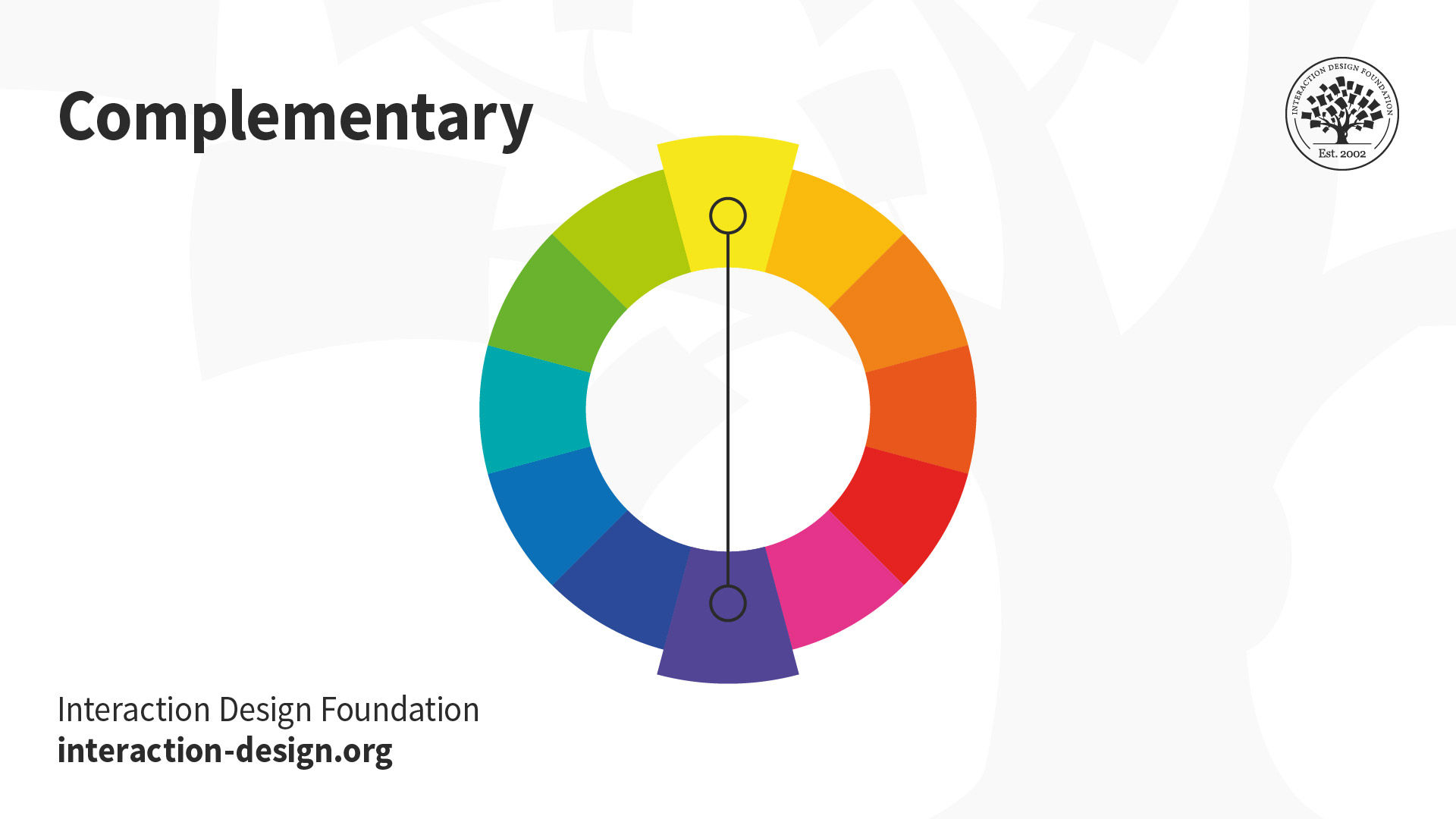
Complementary: Use “opposite color” pairs—e.g., blue/yellow—to maximize contrast.
© Interaction Design Foundation, CC BY-SA 4.0
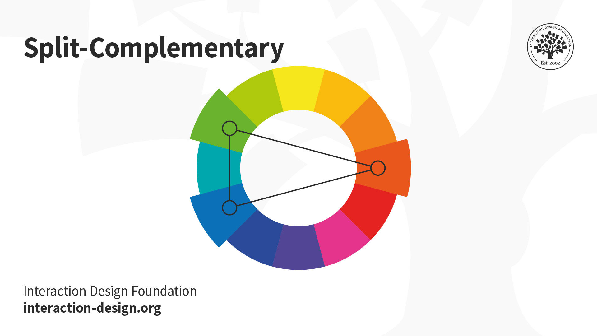
Split-Complementary (or Compound Harmony): Add colors from either side of your complementary color pair to soften the contrast.
© Interaction Design Foundation, CC BY-SA 4.0
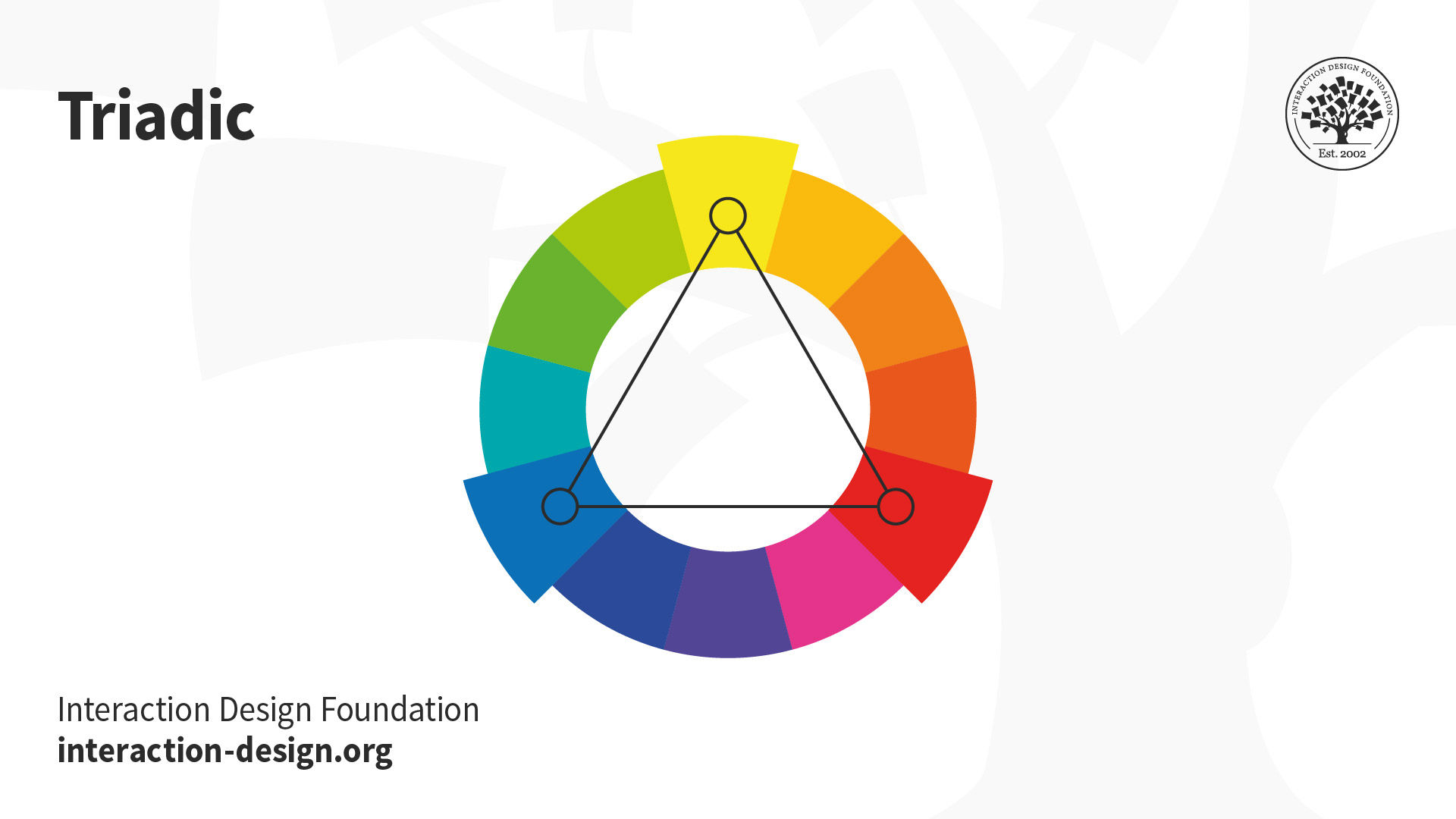
Triadic: Take three equally distant colors on the color wheel (i.e., 120° apart: e.g., red/blue/yellow). These colors may not be vibrant, but the scheme can be as it maintains harmony and high contrast. It’s easier to make visually appealing designs with this scheme than with a complementary scheme.
© Interaction Design Foundation, CC BY-SA 4.0
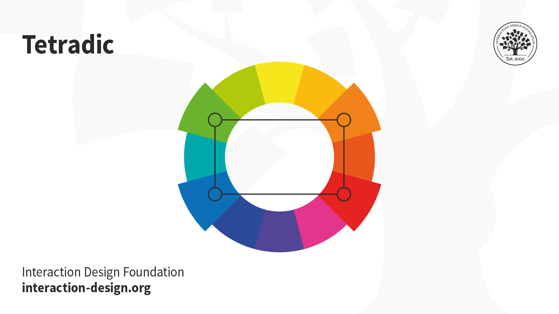
Tetradic: Take four colors that are two sets of complementary pairs (e.g., orange/yellow/blue/violet) and choose one dominant color. This allows rich, interesting designs. However, watch the balance between warm and cool colors.
© Interaction Design Foundation, CC BY-SA 4.0
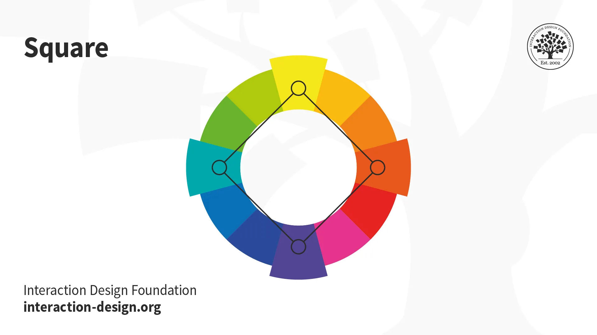
Square: A variant of tetradic; you find four colors evenly spaced on the color wheel (i.e., 90° apart). Unlike tetradic, square schemes can work well if you use all four colors evenly.
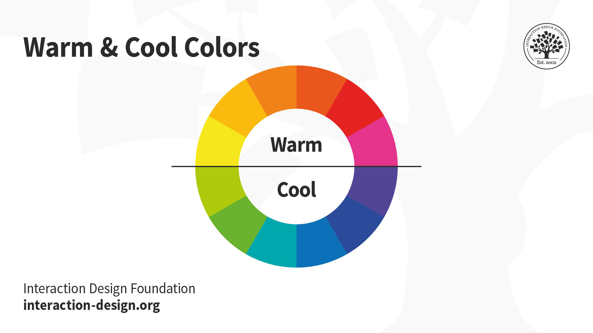
Your colors must reflect your design’s goal and the brand’s personality. You should also apply color theory to optimize a positive psychological impact on users. So, you should carefully determine how the color temperature (i.e., your use of warm, neutral and cool colors) reflects your message.
Use Color Theory to Match What Your Users Want to See
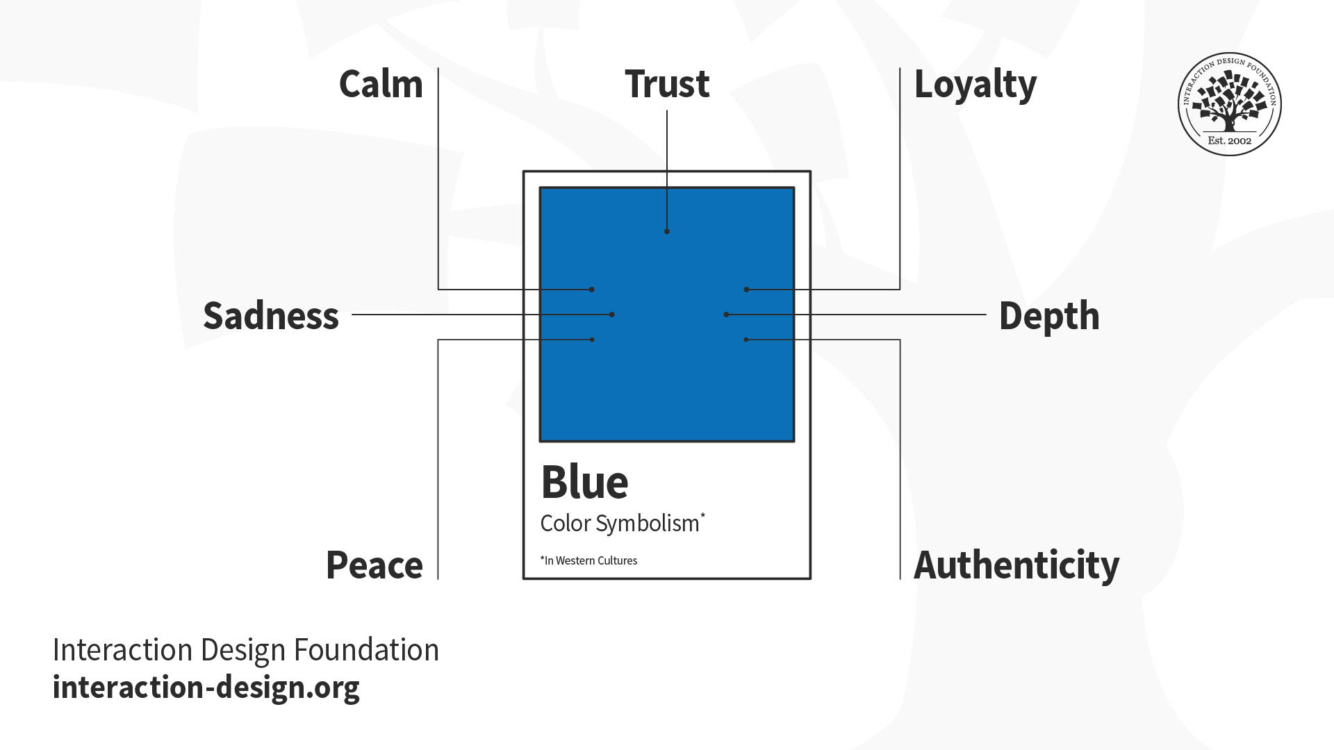
The right contrast is vital to catching users’ attention in the first place. The vibrancy you choose for your design is likewise crucial to provoking desired emotional responses from users. How they react to color choices depends on factors such as gender, experience, age and culture. In all cases, you should design for accessibility—e.g., regarding red-green color blindness. You can fine-tune color choices through UX research to resonate best with specific users. Your users will encounter your design with their expectations of what a design in a certain industry should look like. That’s why you must also design to meet your market’s expectations geographically. For example, blue, an industry standard for banking in the West, has positive associations in other cultures
this is all about color theory